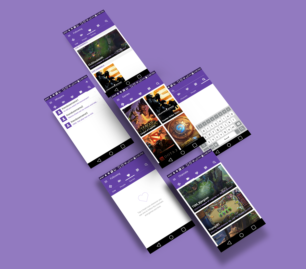
Twitch: ANDROID DESIGN EXPLORATION
Overview
Twitch is a live streaming platform and community that allows viewers to watch and broadcast content such as video games, music, and art. Beginning primarily as just a web service, Twitch has now expanded to a variety of platforms, including the Android mobile app.
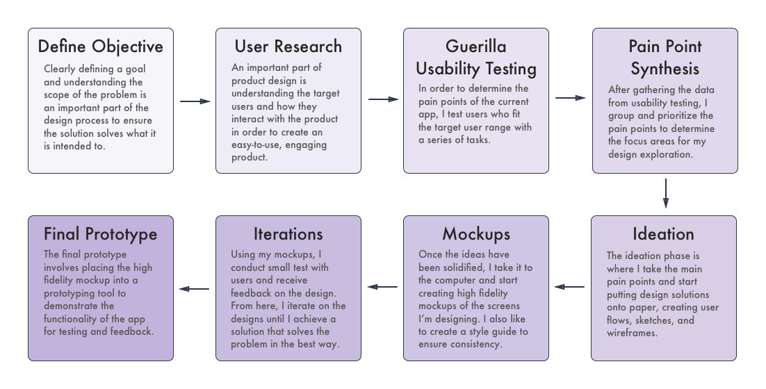
As a fan of playing and spectating video games, Twitch is one of my most used apps on a day to day basis. I decided to explore if there were any design improvements that can be made to the Android app. In order to determine this, I used the following design process:
Define objective
Before I dove deeper into the process, it is important to define the objective in order to approach usability testing and design considerations with efficiency. For this particular project, I won't be focused on redesigning the entire Android app but rather specific features that are causing frustrations amongst users. I will focus on the interaction design and use Twitch's current visual style to implement any design changes.
User Research
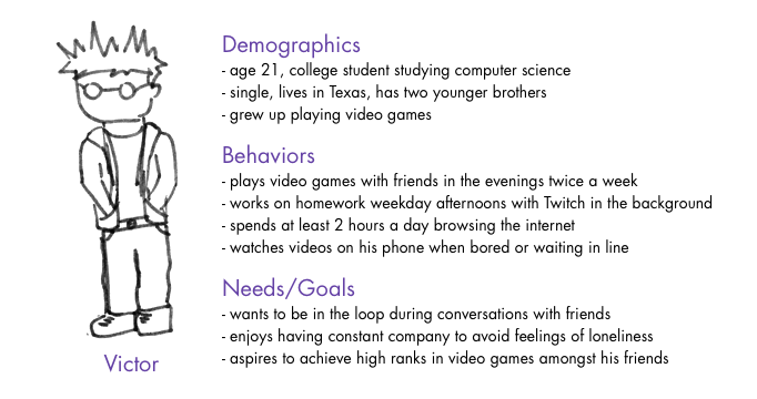
When creating designs for the user, it is important to define the target audience of the app. Below is a persona I created based on my understanding of Twitch's user base.
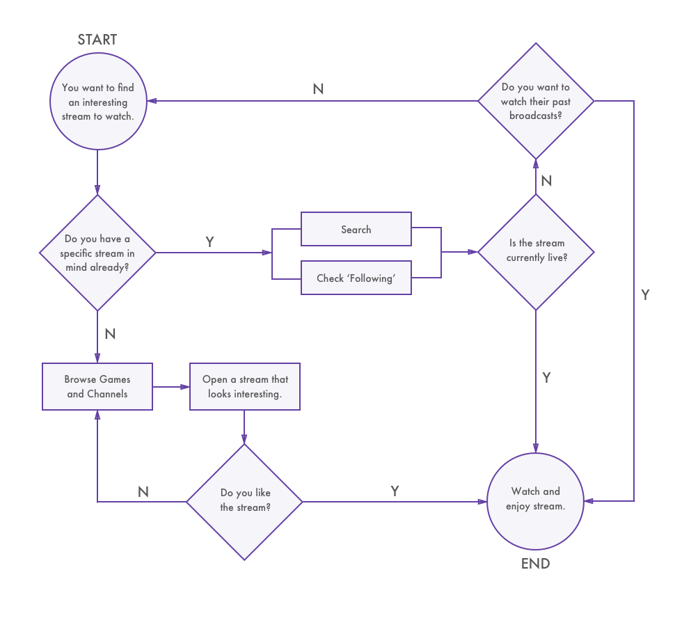
To better understand how a user would use the Twitch app, I created a user flow detailing the process the user would go through in order to find a stream to watch. Based on this, I can then create tasks for the user to perform during the usability testing phase.
Guerrilla Usability Testing
Guerrilla usability testing is a powerful and quick way to test an app and get feedback from users or potential users. Using the feedback I collect, I will then be able to determine which parts of the app could use some improvement. The next question was: where would I find users that fit the target user base I determined earlier? I did some research and discovered AFK Gamer Lounge in San Jose, a place where you play and watch all kinds of video games with your friends.
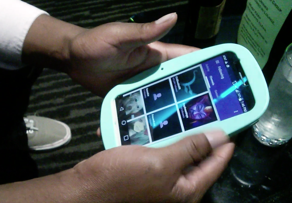
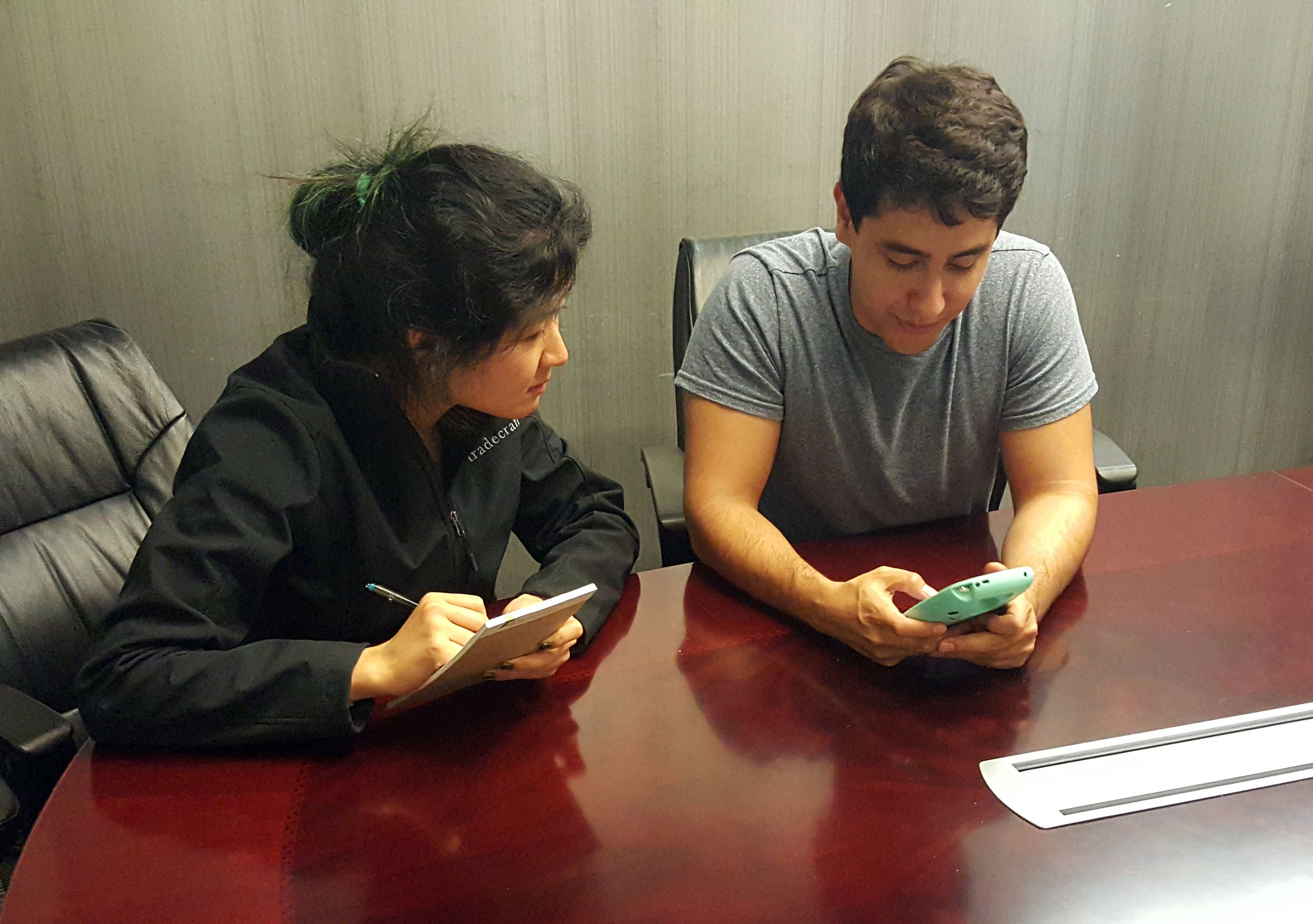
I approached customers at the lounge and asked if they could spare 10 minutes to help me with a usability test. I created a series of tasks that a typical user might encounter and presented them to my testers. I made sure the tasks were very broad and avoided leading questions:
Your favorite streamer, who you follow, was live 5 hours ago, but you missed it. You want to watch the VOD of their last broadcast.
Find the streamer of Grand Theft Auto V with the most viewers right now. You want to know when they’ll stream again in the future.
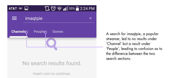
Your friend told you about a streamer named imaqtpie. You want to know more about him. How would you do this?
Open up a stream of Dota 2. You’re concerned the stream is using up too much bandwidth. What would you do?
Some initial observations include:
“There’s no option to follow.”
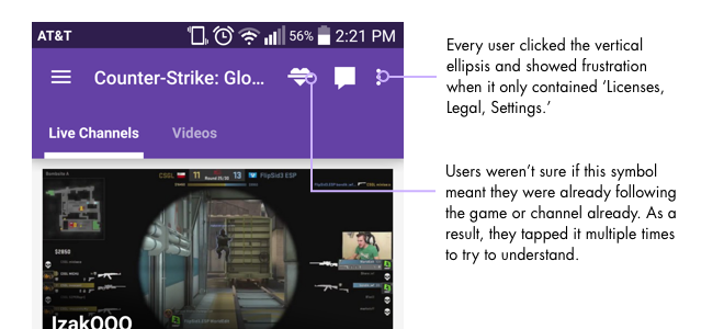
“Licenses, Legal, Settings! It’s never helpful!”
“I’m not sure what Channels and People mean.”
“I can’t find the game.”
Pain Point Synthesis
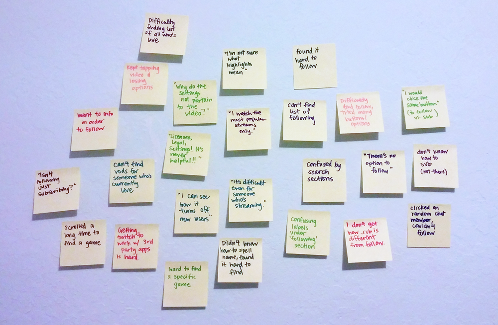
Once I completed the usability testing, I went over the videos from the testing sessions and jotted down the different pain points and comments users had with the app.
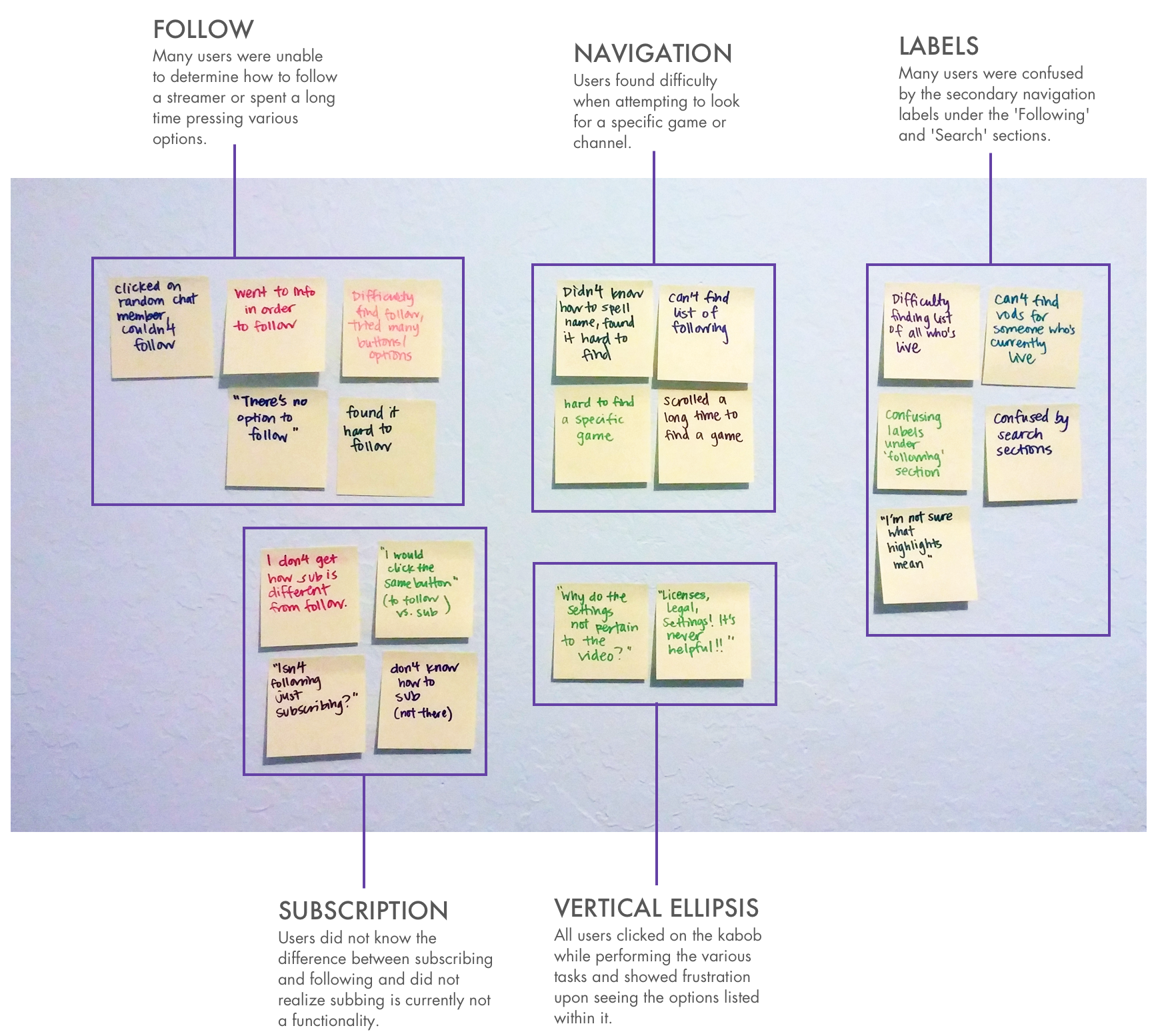
With all the data written down, I was then able to group the different pain points into categories to focus on.
Ideation
Since users found the labels under the 'Following' and 'Search' sections confusing, I conducted a comprehension test with a series of users with the original wording and the new wording. I showed 4 different subjects what they expected to find under each section in both the 'Before' and 'After' and discovered that the new labels showed better comprehension.
The key issues users were having in the 'Before' section that are solved in the 'After' were:
- Users thought 'Activity' meant recent activity from people you follow rather than live activity from people and games you follow.
- Users did not understand the different between 'Channels' and 'People'.
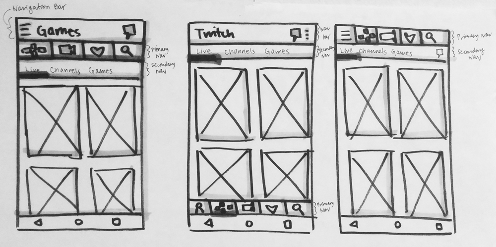
Next, I wanted to develop a navigation that would allow users to browse games and channels more easily. For inspiration, I examined the various ways other apps designed their navigations. I considered the different goals and functionalities of each app and why they chose to approach their design in the way they did.
I sketched several wireframes on how different navigations would look in the Twitch interface.
mockups & Iterations
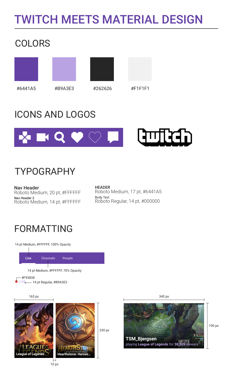
Consistency across designs and platforms is important to create a clear, easy-to-use experience for the user and to establish brand identity. Before I converted my wireframes to a digital mockup, I created a style guide for Twitch's Android app, so I can design with consistency across different screens.
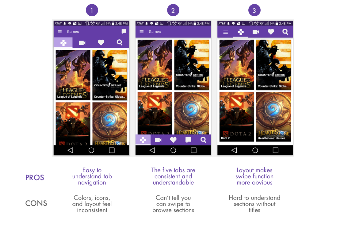
Here are three of the initial mockups. I noted the pros and cons of each design and received some insights and feedback from users and other designers.
Analyzing the pros and cons from my initial mockups, I created final mockups. I used the title navigation from mockup 1, the five tabs from mockup 2, and the top nav layout from mockup 3 to create the new navigation layout seen below.
final Prototype
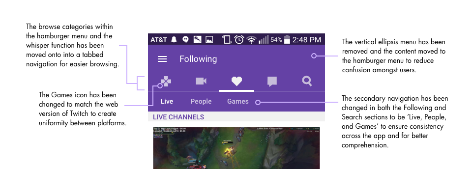
The new navigation design helps solve the pain points users had with navigation, labels, and the vertical ellipsis. The diagram below highlights the main changes to the navigation for the Twitch Android app:
The updated channel view design helps solve the pain points users had with navigation and following. The diagram below highlights changes made to the channel view of a stream:
Below is a clickable prototype with the final designs. Have a look!
DISCLAIMER: I am in no way affiliated with Twitch. This is an unsolicited design project for personal purposes only.
